
LOGO
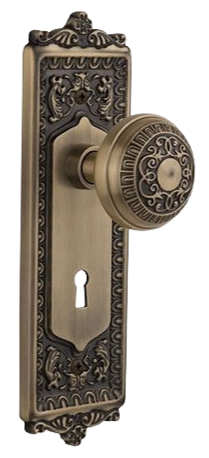
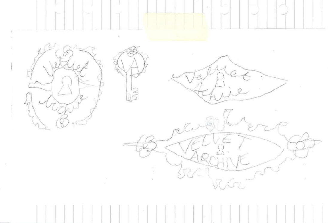
The logo is inspired by a vintage doorknob plate. I wanted it to feel like they were unlocking the room of archived pieces from the 1950s. As if we were selling clothes that were once locked away, almost as if they found this gem of a clothing brand that there is only 1 of.
COLOR PALETTE
Blue, pink, and green were popular in the 1950s to symbolize post-war optimism, so I knew I wanted to resemble that in the overall color palette.
TYPOGRAPHY
To reflect society’s views on femininity and sensuality in the 50s, I wanted the text to feel soft and romantic. I used a sans-serif font to tie that in with elegance.
MOOD BOARD
Key Words: Soft, feminine, and romantic
BUSINESS CARDS AND PACKAGING
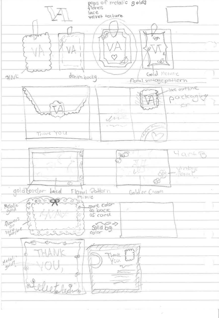
My intention was for it to look new but with lots of character, not too polished, but still keep a clean look by not adding too much texture.
HANG TAGS
Intention: For it to look like 2 fabrics that have been sewn together. I added the linen texture in front of a floral pattern (which was very popular in the 50s) and added a dashed line to resemble stitching.
THANK YOU CARDS
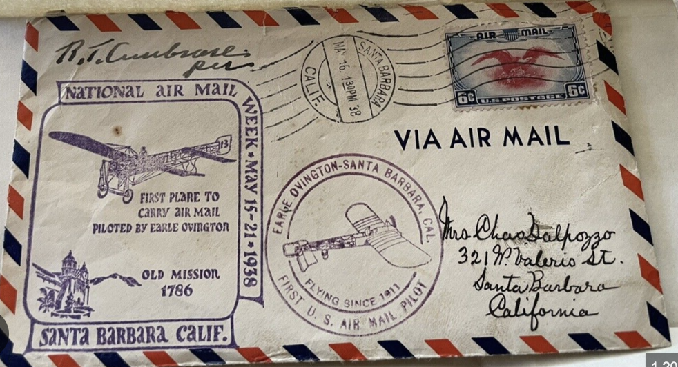
Inspired by old vintage postcards
SOCIAL
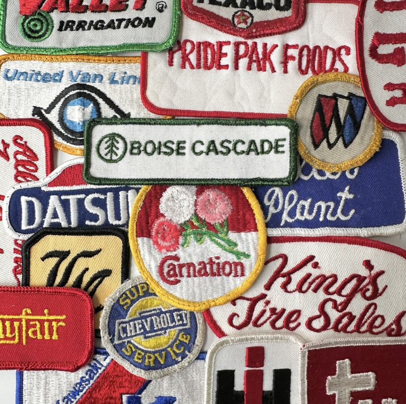
Highlight covers inspired by vintage patches
